Thursday, July 28, 2016

Cracks & Crevices

I love proofing a new plate and this week I had the opportunity to continue
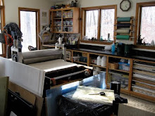
working on my rock series.

As I mentioned, I'm drawn to the spaces between rather than the rocks themselves and have begun referring to this series as "intimate spaces" because I can't help but see suggestions of human characteristics. 


This 12.5" X 15.5" plate printed beautifully and although I was really pleased with the black and white version, I wanted to experiment with adding a bit of color.

Color options 1 and 2 and a bleed print version.

Incorporating chine colle', it wasn't long before I had a few different versions and was hard-pressed to decide on which way to proceed. I may just make this a variable edition.

The version above seemed like a bit too much color so at the moment I'm leaning toward the version below. Once again, time to step away for awhile and look at it anew in a few days.


Wednesday, July 13, 2016

Continuing with rock series

I've had a week back in the studio so I've continued with my series based on the rock revetment at the beach.

I worked up a few studies and made some test plates.


These first proofs came out a bit odd. There's a lighter halo around the perimeter of both plates as if the center was exposed more than the edges. You can see from the proofs that the center of each print is darker than the edges. I'll definitely need to figure out what the problem is. The plates measure only 4"x4" and I'm thinking the edges bent slightly when I trimmed them in the paper cutter. This would mean the film positive wasn't in direct contact with the entire surface during the exposure.

I did manage to print a plate I had made earlier and was pleased with the results.


Here's the first proof: carbon black Akua intaglio ink on Arnham heavy weight paper.


I cut a few shapes out of a tissue paper to add a chine colle' accent to the image. I definitely want to add a spot of color but the only tissue I had was this pale pink. I've had paper on order from Graphic Chemical & Ink for a month now but I'm told it's still on back order. I may need to resort to hand-coloring an accent with watercolor. I'll live with this a bit before I make a final decision.


The print below has the pale pink tissue accent.
I continue to be fascinated with the cracks and crevasses among this collection of huge rocks. When singled out, the spaces between the granite forms become more interesting than the rocks themselves and take on an anatomical quality.