Wednesday, February 26, 2014

Problem solved

original ink left - new ink right
A big thank you goes out to Susan Rostow and Bud Martin, the director of research and development at Speedball. They are the best!!

Susan put me in touch with Bud who sent me some ink to try out and it was a match to the original!

I'm very thankful that I won't have to redo the plates that I had already printed for my edition. All I have to do is get back to work and finish the edition now that the ink issue is solved and the new baby is here; healthy and happy.


Monday, February 17, 2014

Oh NO!


When I got back from Boston on Saturday, I was happy to find that my ink order had arrived because I was eager to continue printing my edition.

Even though I had intended to get started tomorrow morning, I couldn't resist pulling a proof this evening to make sure everything was to my liking. Boy was I in for a disappointment.

Origninal Paynes Gray on left, new one on right.

I had started my edition using a small container of Paynes Gray that I had purchased from Rostow & Jung, before Akua was sold to Speedball. The color was perfect right out of the jar and I had assumed that when I reordered the same Paynes Gray from Speedball, it would match the original. Not so!

From the beginning, I have always been a big advocate of Akua ink; a great product that always gave me consistent results. This was the first time I had used Akua purchased from Speedball and to be perfectly honest, it didn't seem the same as the original.

Difference between the two grays.
I felt that it was more difficult to wipe off of the plate and seemed gummier and stickier than the original. As you can see, there's a big difference between the Rostow & Jung Paynes Gray and the Speedball Paynes Gray. This is a huge problem because I had already printed more than a third of an edition of 35.

The best thing I can do at the moment is step away for the night and see what I can do in the morning to try and resolve the issue.


Keeping the momentum going.

Spent the day organizing and reviewing what I had accomplished last week; hoping that I can keep up the momentum and finish my current project in a reasonable amount of time. It's all about following through and keeping distractions to a minimum.

After today's experimentation's, I came to the conclusion that I need to redo the plate for the right hand section of the image. If I leave it as is, the connection to the center print falls too close to the fold and with the stitching, it's difficult to crease. On the positive side, I can use the left and center sections I've already printed so there won't be too much lost in the redo. I'll get the new plate done tonight so I'm ready to go in the morning.

More snow is predicted for tonight and my back deck (on the north side of the house) has become a gauge for Old Man Winter's offerings.


However, a very bright spot in this season of snow storms is the arrival of Scarlett.  Finding a new photo in my mail always brightens my day and reminds me that Spring is just around the corner.


Sunday, February 16, 2014

Love at First Sight


Granddaughter Scarlett Ruth arrived and was the perfect "gift" for the week of love. Headed up north for a few days to provide support and look after her big brother while mom was busy. The perfect ending to a very productive week.

"A new baby is like the beginning of all things-wonder, hope, a dream of possibilities." 
Eda J Le Shan

Saturday, February 8, 2014

Time to step back.


This morning I played around with adding machine stitching to the image using a heavy decorative thread. I added a straight stitch and a zig zag to the print and both worked as I had hoped.

Next, I carefully folded the print every six inches. I used an old dental tool to lightly score the surface to make sure I got the best crease possible. Once I had the two folds done, I trimmed the top and bottom edges of the print and was happy to see everything lined up correctly and I did indeed end up with a 6"x 6" sqaure.

Folded print.

I had also decided to cut out 3 sections along the top edge of the image. I liked the way it broke up the long horizontal line.


Folded and trimmed with some experimental stitching added.
 
Now my dilemma. I had originally planned to add a watercolor wash to a few areas of the fabric.


Proof with watercolor wash.

Once I had, I wasn't sure that was the way to go. I tried adding watercolor to a second print accenting  only the ribbons. At this point, I'm just not sure which way to proceed so I think it's time to step away from the image for awhile and hopefully, when I come back to it, I'll be able to resolve the issue.

Painted ribbons.
Sometimes it takes a fresh perspective, so if you've been following along, any feedback would be greatly welcomed.


Friday, February 7, 2014

Trimming & Glueing


I managed to print just about half of the required prints, for an edition of 40, before running out of ink. Printing will need to be on hold for awhile since the ink won't arrive until next week and I have a feeling that by the time it does arrive, I'll be in Boston helping out with my new granddaughter.

Before calling it quits for the day, I wanted to see how the individual prints lined up and if the process was easily repeatable. I started by trimming the vertical sides on each print followed by trimming the points at which the end prints would overlap the center section. I used an archival bookbinding paste to carefully join the sections, making sure that the entire piece measured 18. I'm using my antique irons to weigh down the joints over night. My plan is to trim the horizontal edges after the piece is folded. Tomorrow I'll experiment with some machine stitching on the image.

All sections successfully joined.


Little has changed.


I always find this sight very satisfying; a full clothesline.

Today's prints drying in the sun reminded me of some photos I had in a very old album that always brings a smile to my face. I decided to dig them out and share.


From the beginning, I apparently was fascinated with clipping clothes pins to a line. Here I am at 18 months happily doing my thing.


As time passed, I was still at it but had graduated to pinning up my doll clothes. (Ah, childhood in the early 50's.)

It's amusing that decades later I'm still pinning things to a line and getting just as much enjoyment out of it.


Editioning Begins

First prints.

Decision made; I went with the Paynes Gray ink. The soft blue gray works well with the subject matter.

The plates were printing well and in about an hour and a half I had a dozen prints pulled. I want to keep the momentum going but it looks like I'm going to run out of ink. I had one of those small 2 ounce sample jars of ink and I looks like I may get another 10 prints before I'm scraping bottom.

What's that adage about "prior proper planning".


Don't go against the grain.


Sized for the different plates.
I began the day getting my Hahnemuhle Copperplate cut to size and ready for editioning. Because this particular print will be folded in two places it was important to consider the direction of the paper fibers.

Paper has a grain direction and making a fold parallel to the grain, yields a cleaner fold. Once I was satisfied that I had the fold in the correct orientation, I made sure to mark the papers I had torn down so I wouldn't inadvertently turn them the wrong way as I was printing.

Check out http://www.foldfactory.com/teach_lesson_1.html for a quick, informative description of determining the paper grain.

Watermark.


Thursday, February 6, 2014

Decisions, decisions.

Akua Intaglio: Graphite on the left, Akua Intaglio: Paynes Gray on the right.
I played around with some color options today and narrowed it down to these two choices. The trouble is I like them both and I'm finding it hard to choose between the two. I like the blue tint in the Paynes Gray but then again, there is something straightforward and graphic about the print done in Graphite ink. Since I'm considering adding a watercolor wash in a couple of places on the print,  I'll need to factor that into the decision as well. I think my next step is to print out a couple of copies of the full image before making my final decision.

Wednesday, February 5, 2014

Working it out


Proofs

I've made the plates and have proofs of all three sections of the image. I'm happy with the results but now the moment of truth is at hand. Will I be able to do what I originally planned and link up the three sections?


The first step was to trim the prints at just the right point. I need be able to sew them together without running into any difficulty at the folds.

Trimmed sections


I have a feeling this is going to be really time consuming and labor intensive for an edition of 40, considering I need to print three separate plates for each print, trim them, and stitch them together. I'm using Hahnemuhle Copperplate paper, which is a decent weight, so cutting & folding will be slow going. As soon as the prints are dry, I'll do a test to see if I can stitch through the paper with my sewing machine.

Test piece.


Here's the results of trimming and taping the proofs together. Fortunately, the sections line up as intended but I'll need to be really careful with the folding so all the outer edges line up.

I still need to settle on an ink color. I like the carbon black; it has a sinister look about it which I like with the subject matter but I'll do a few more proofs with different inks to make sure I'm ready to edition.

Now that my plates are finalized, I'll cut all the paper to size so it's ready to go when I am.

I'm trying to make as much headway as I can because my second grandchild is due any day now and I'll need to abandon my studio for Boston to look after Phineas while his sister makes her arrival. Exciting time ahead for sure!!


New Plates

More proofing is underway. I decided to do a few small test plates to make sure I had the exposure time right for this particular image.

I exposed a new plate and shortened the wash-out time to just under a minute. The softer brush worked really well. It would be a little small for large plates but was perfect in this particular case.

New print on left - old version on right.


It's a little difficult to see here but the shortened wash out time took care of the open biting and the print ended up being much sharper. I decided to use a Solarplate scrap to make a test plate, for a different section of the image, and increase the exposure time to see if I could get a bit more detail.


Eleven light units for both image & aquatint screen.

I liked the results so I upped the exposure time again but this time exposed the transparency first and then the aquatint screen second. I gave the transparency 12 light units followed by 10 light units for the aquatint screen.

Comparison of test plates.

For this particular section of the image, I liked the clarity I ended up with on the plate with the longer exposure time. There was a better balance in the over all value of the plate and a bit more detain.

Overcast Days


Snowy, overcast days are perfect for working with light sensitive plates. My studio has three walls of windows so on sunny days I need to be extremely careful when working with light sensitive film or plates to avoid uv exposure. Today's snow storm provided the perfect cover to freely work with the Solarplates for my current project.

3 Transparencies
 I was pleased to find that I could get my three transparencies to fit comfortably on a 14"x 16" Solarplate with very little waste. Hopefully, I won't need to re-do any plates because that can get expensive!

Exposure unit


I fired up my Nu Arc and exposed the plate first to the aquatint screen and then to the transparency. I went with 10 light units for both.

I found an old Maybelline makeup brush that was much softer than the mushroom brush I had originally been using. This guaranteed a much gentler wash out procedure.

I used a small vinyl magnet attached to a sheet of plexiglass to hold the plate in place during the developing process to stop it from sliding around  and make it easier to keep my fingers off the plate.


I reduced the developing time to one minute, removed the plate from the water bath, squeegeed it off and dried it with a heat gun. The plate was put back into the exposure unit for a post exposure of light to harden the surface.

Here's the new plate. Now I'll see if a shorter developing time yields better results. Fingers crossed.


Proofs


Here are the first proofs. The Solar plate is on the right. The center print was done on dry Hahnemuhle Copperplate paper using Akua Carbon Black ink. The print on the left was printed on damp paper with chine colle' added.

I use a double exposure process by first exposing the plate to an aquatint screen followed up by the film positives. I do think doubling up the transparencies for a denser film positive made a difference. Subtle details that often get lost due to over exposure were picked up on the plate. However, the proofs came out a little too dark and there were some open areas that didn't print. I think this was due to over developing the plate; some areas were "bitten" too deeply and detail was lost.

This first plate was processed in a cool tap water bath (approximately 68 degrees) for 1:45 which may have been a little too long for this particular image. One to two minutes is recommended for processing an intaglio plate. I use a soft brush (one for cleaning mushrooms) to gently go over the plate as it's developing but I always need to be careful that I'm not overly aggressive with this step.

I'll try again, reduce the developing time and be careful with the brushing of the plate; maybe find a softer brush. An old makeup brush might work well.


Getting down to business.


After some morning snow shoveling, I headed up to my studio to work on "Second Skin". No more procrastinating!

Mock up, film positives, and exposed plate.


It was worth taking time to create a photocopy mock-up of my proposed image. Knowing where the folds would land helped me plan the size of my three segments and decide where to overlap the prints for stitching. At this point, my film positives are ready and I'm set to begin proofing.

Doubled up film positive of right hand section.


I'm trying something a little different this time when exposing the Solarplates. I've printed two copies of my image onto transparencies, carefully lined them up and taped them together. I want to see if increasing the density of the black laser printer ink makes for a better exposure. There's always so many variables to consider when creating a light sensitive plate that a fair amount of experimentation occurs with each new image.

Now, lets see what happens.

New Group Portfolio

I've been playing around with various ideas for an upcoming group portfolio for The Printmakers' Network of Southern New England. http://www.printmakersnetwork.org This will be our seventh group project and one with interesting parameters. We're calling it Print Cubed.

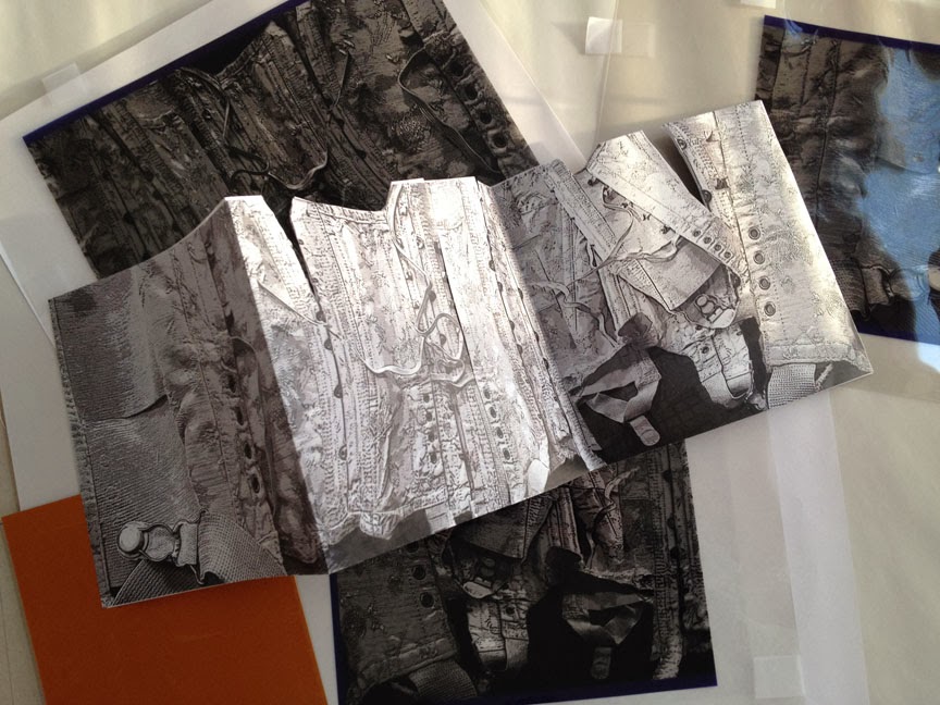
Mock up and film positives.

The idea is to create an edition of 35 prints that will be presented in 6" X 6" cubes. The twist however is that each individual print will measure 6" X 18"; the images will need to be folded to fit into the cube. Each printmaker has the option of either creating three individual, but related images, on the long narrow sheet or one continuous image. When completed, each participating artist will receive a portfolio, with a few extras available for sale.

I've always looked forward to participating in these group projects. This one in particular is intriguing and I welcome the challenge of trying to create one continuous image that will lend itself to being folded.

After a lot of frustrating stops and starts trying to find the perfect subject matter, it occurred to me that this accordion format was reminiscent of a length of folded fabric; a logical analogy for someone who's been sewing all her life. 

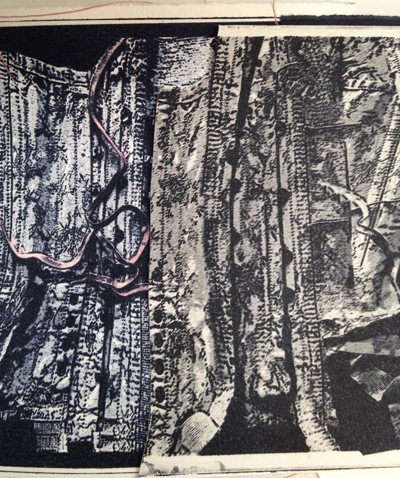
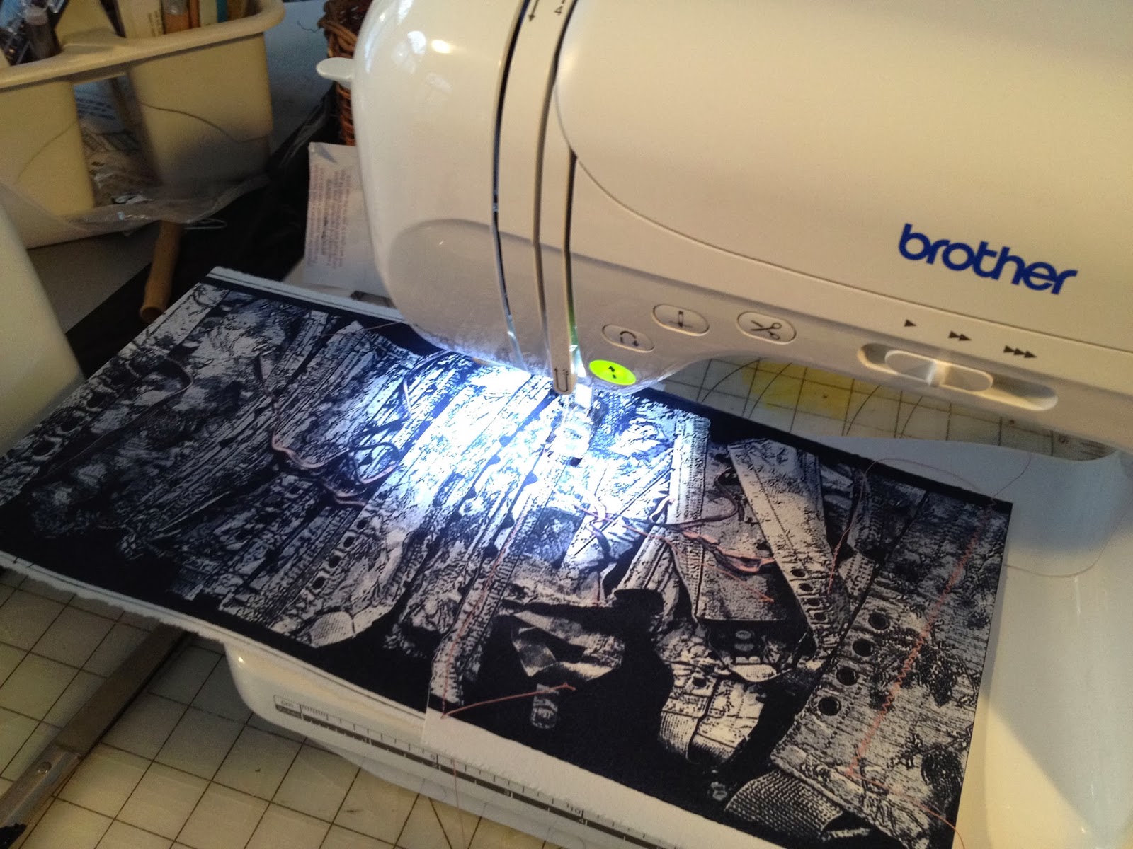
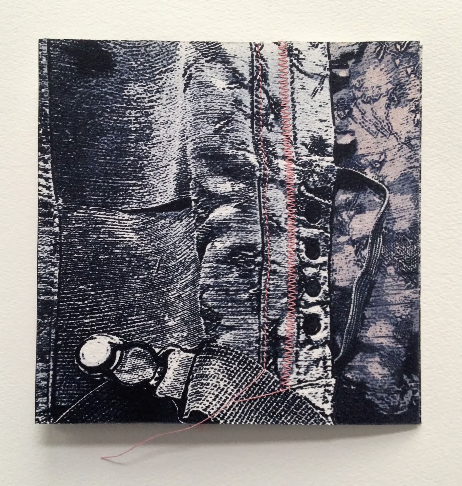
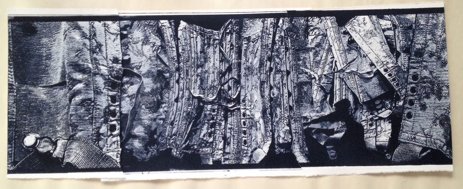
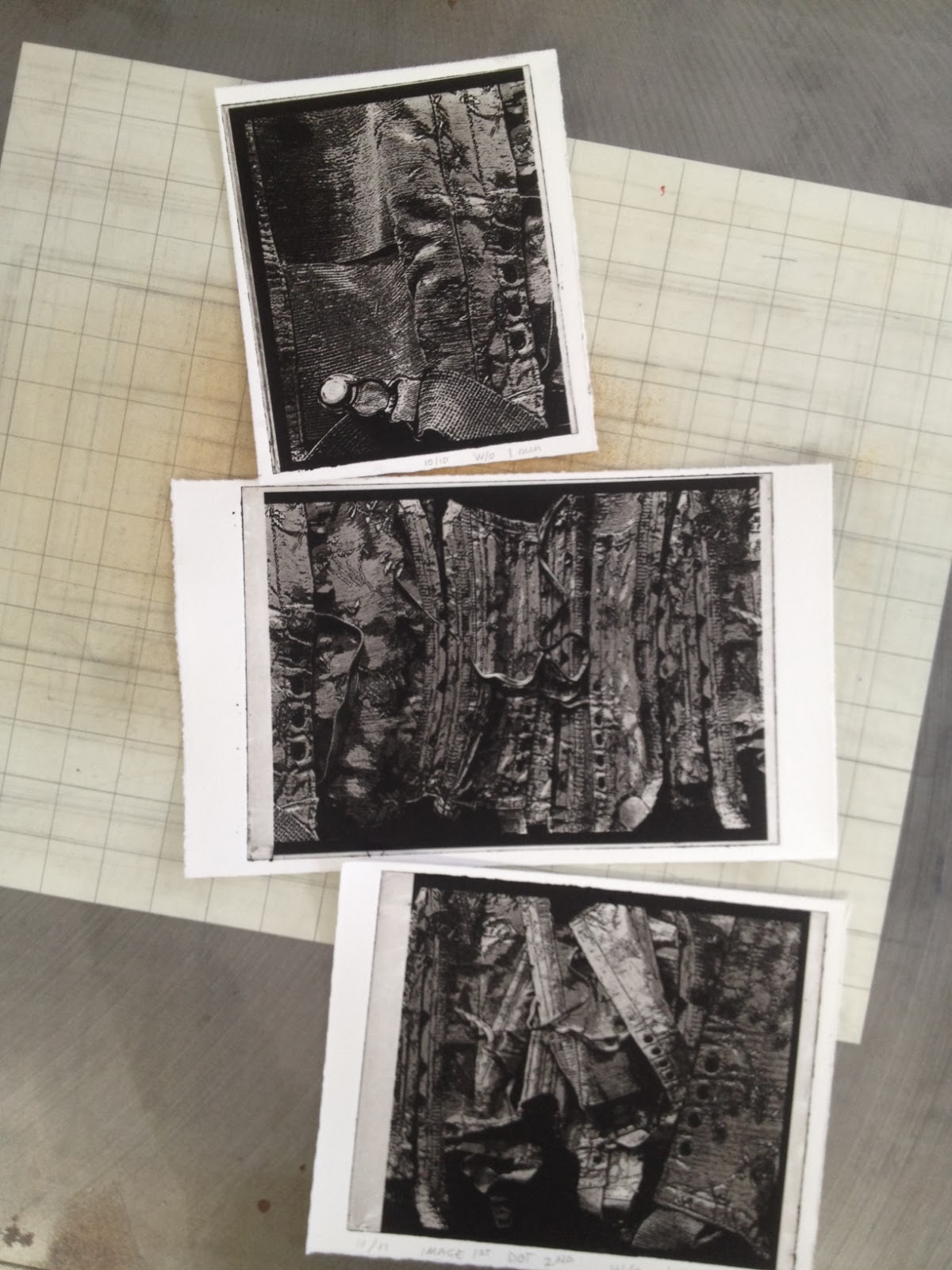
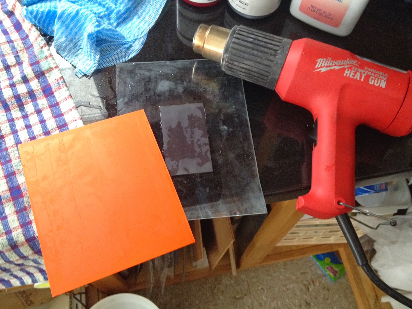
An old corset became my jumping off point because like the folded paper, a corset is compact until stretched out. I did a number of planning sketches, photographed the corset, used Photo Shop to extract various sections, then reassembled the pieces to fit the page to my liking.

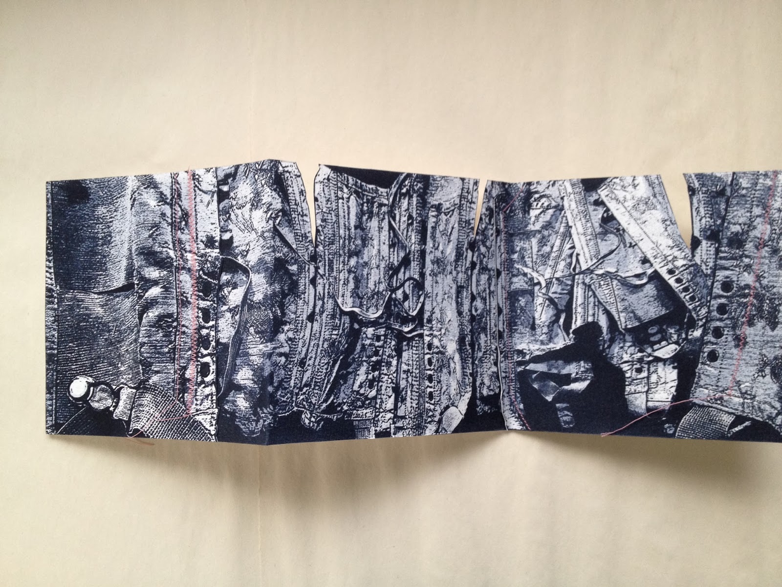
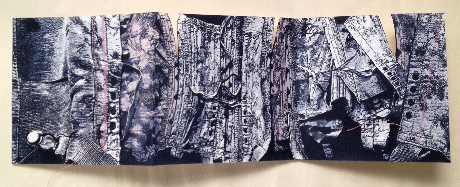
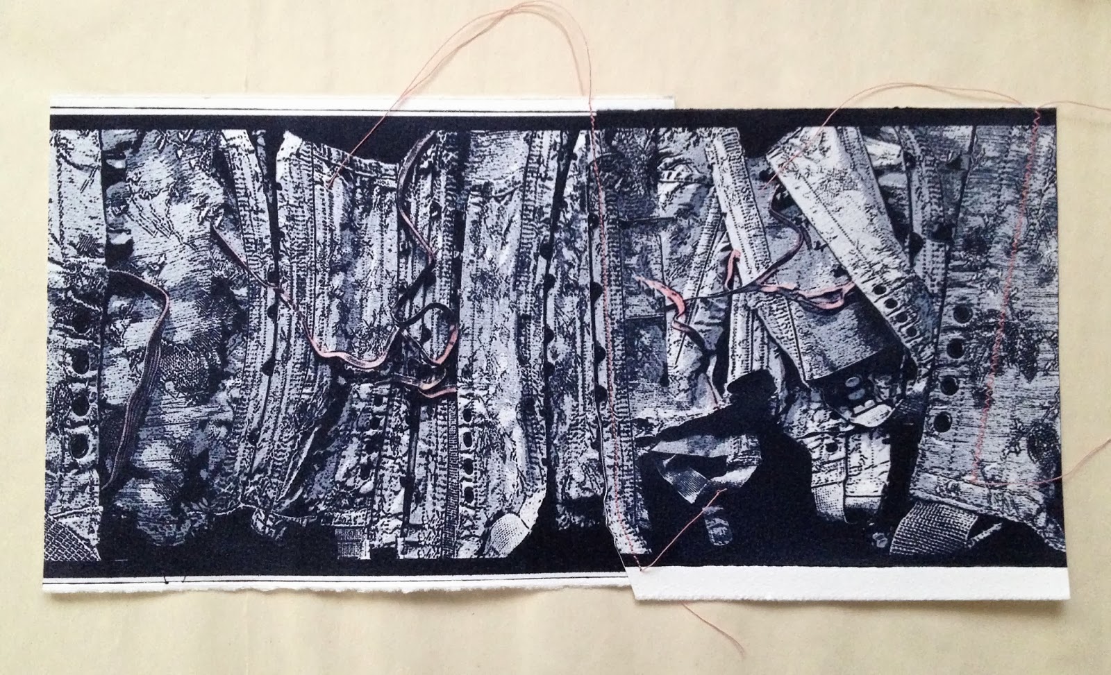
I soon realized that it was necessary to create a mock-up of the imagined print because I needed to see where the folds would land. To reinforce the fabric theme, I'm considering breaking down the image into thirds so I can print the sections individually and then machine-stitch them together to create the full 18 inch print. I'll need to plan carefully for the overlapping to avoid the folds.

Mock-up of front and back of proposed print.

Another consideration is whether or not to print on the back side of the paper using one of my body print images. I'll wait and see what develops but at this stage "Second Skin" seems to be off to a decent start.


Tuesday, February 4, 2014

Ready to Ship


"Time & Tides" completed. Trimmed, labeled, packaged and on their way to Wingtip Press for Leftovers V.  


Monday, February 3, 2014

Leftover Exchange V

Beautiful; but I'm so looking forward to Spring!

Spent a snowy Monday in the studio working on a print for Leftovers V, an annual exchange project by WingTip Press. http://leftoversanyone.blogspot.com/

I often end up with small sized pieces of Solarplate so this exchange project is a great way to put them to good use. Since the maximum paper size is no more than 5" X 7" my leftover scraps of Hahnemuhle Copperplate paper didn't go to waste nor did a small jar of Akua Ink I had custom mixed for another project.

Inked plate ready for the press.

To keep the leftover theme going, I dug out an image that I had created after super storm Sandy hit but never got around to doing anything with. It too deals with leftovers; an altered shoreline littered with rocks and punctuated with small ponds. I build the image in Photoshop using photos I took after the storm and added a web image of the moon's phases.

I'm pleased with the results and I'll consider adding some watercolor to the print after I've stepped away from it for awhile.
Always a satisfying sight.
I've been a bit lost lately when it comes to my studio practice; a lot going on with the holidays and a new granddaughter due very soon. So, this project was just the thing to get me into the studio knowing I could get an edition of 15 completed before I was called on for "grandma duty".

If you're interested in participating in Leftovers V you have until the due date of April 15th. Check it out and put all your studio leftovers to good use.